

Expressive Graphic Tees: How to Wear Your Personality
Table of Contents
- Why Expressive Graphic Tees Say What You Can't
- How to Style Graphic Tees Without Looking Like a Billboard
- Graphic Tee Outfit Ideas for Every Kind of Day
- Fabric, Fit, and Print Quality: What Separates a Keeper From a Closet Orphan
- Styling Expressive Graphic Tees for Your Body Type
- Building a Capsule Wardrobe Around Statement Tees
- How to Care for Printed Apparel So the Message Lasts
- Frequently Asked Questions
Last Updated: September 23, 2026
Why Expressive Graphic Tees Say What You Can't
Expressive graphic tees carry a message, joke, or idea on the front, turning a basic layer into personal speech. A plain sentence on cotton can say what a person might not say out loud.
How to Style Graphic Tees Without Looking Like a Billboard
The trick to styling graphic tees is contrast. A loud shirt needs quiet partners; a subtle one can handle more visual noise. The mistake is treating the tee as the whole outfit instead of the anchor.
Layering, Tucking, and the One-Third Rule
A relaxed-fit tee looks intentional when it's tucked at the front only, leaving the back loose. That front tuck breaks the body into roughly one-third and two-thirds, which reads as styled rather than sloppy. Layering works the same way: a flannel, denim jacket, or open button-down keeps the message visible while adding structure.
- Front tuck only: keeps the graphic readable and defines the waist
- Half-zip or open layer: frames the print instead of hiding it
- Cuffed sleeves: adds shape to a boxy fit without tailoring
- Neutral bottoms: let the shirt carry the personality
Graphic Tee Outfit Ideas for Every Kind of Day
A graphic tee outfit works best when it matches the energy of the day, not a trend. Errand days want comfort. Coffee runs want ease. Neither needs a full styling session.
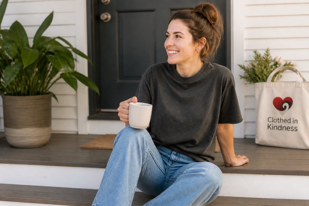
Errands, Coffee Runs, and Low-Effort Weekends
The uniform is simple: a heavyweight cotton tee, straight-leg jeans or relaxed shorts, and a cap. A dad hat with an embroidered phrase finishes the look without adding noise. For cooler weekends, swap the tee for a hoodie or sweatshirt with the same message energy, the Anti-Social Butterfly Hoodie carries that "present on my own terms" idea in a heavier layer.

Fabric, Fit, and Print Quality: What Separates a Keeper From a Closet Orphan
Most graphic tee advice stops at "buy heavyweight cotton." That's a start, not an answer. Three interacting variables decide whether a shirt survives two summers or two washes: the fabric it's printed on, the cut, and the printing method. A great graphic on a flimsy blank still ends up a sleep shirt.
Start With the Fabric
Fabric weight, measured in ounces per square yard, is the first filter. A 6.1 oz ring-spun cotton tee holds its shape and drapes with structure; a thin 4 oz shirt goes limp after a few washes. Ring-spun cotton also softens over time instead of pilling, because the fibers are twisted tighter during spinning.
- Combed vs. carded cotton.
- Garment-dyed vs. piece-dyed. Garment-dyed shirts are sewn first, then dyed, which is why the color settles into a muted, vintage tone and why the shirt feels broken-in from day one. Piece-dyed shirts are cut from pre-dyed fabric and hold a flatter, more uniform color.
- Pre-shrunk vs. not. A pre-shrunk cut layers well and doesn't cling after the first wash. An unshrunk tee can lose a full size in length, which is how a relaxed fit becomes a crop top nobody asked for.
Fit Is a Silhouette Decision, Not a Size Decision
Fit matters just as much as fabric, and it's where most people get stuck. A relaxed, pre-shrunk cut layers well and doesn't cling; boxy or oversized silhouettes read as intentional streetwear, while a too-tight tee reads as a mistake. The difference between oversized and sloppy comes down to shoulder seam placement and hem length: past the shoulder edge by more than an inch or two is oversized, and a hem below mid-thigh is a dress.
How Print Methods Actually Differ
Screen printing pushes ink through a mesh screen, one color at a time, laying down a thick, opaque layer on top of the fabric. It holds up for years on solid colors and simple, bold graphics, but struggles with photos or gradients because each color needs its own screen. A six-color design means six passes, which is why it's cost-effective at volume but expensive for small runs.
How to Tell What You're Looking At
You can usually identify the method by feel and sight:
- Screen print: the ink has a slight raised texture. Run a fingernail across it, it feels like a thin layer sitting on the surface.
- DTG: the print feels almost flush with the fabric. On dark shirts, look for a faint white halo around the design, which is the ink base showing through.
- Vinyl: the print feels like plastic. It has a distinct edge you can catch with a fingernail, and it doesn't stretch with the shirt.
Why Fabric and Print Have to Match
If you're shopping a specific design, check the product page for the fabric weight before you commit. Fits and sizing vary by garment, so review the sizing information for the exact product rather than assuming your usual size will translate.
Neener Neener T-Shirt — Playful Quote →
Styling Expressive Graphic Tees for Your Body Type
Expressive graphic tees flatter most body types when the fit follows the frame rather than fighting it. The goal is a clean line from shoulder to hem, with the graphic sitting where the eye lands first. A graphic tee isn't just a garment, it's a rectangle of visual weight on your torso, and where that rectangle sits changes how the outfit reads.
The Two Rules That Do Most of the Work
Rule one: shoulder seam placement. The seam where the sleeve meets the body should sit at or just past the edge of your shoulder. Inside that line, the shirt looks tight; more than an inch or two past it, the shirt looks borrowed.
Matching Fit to Frame
| Body Type | Fit to Choose | Styling Move |
|---|---|---|
| Tall and lean | Relaxed or boxy | Half-tuck to break the length; avoid shirts that end above the hip |
| Broader shoulders | Classic or relaxed | Avoid tight crew necks; a V or scoop opens the chest line |
| Shorter torso | Slightly cropped or front-tucked | High-waist bottoms to balance; skip long hems |
| Curvier frames | Relaxed, not oversized | Straight or wide-leg bottoms; avoid cling at the waist |
| Broader midsection | Relaxed with structure | Look for heavier fabric that drapes rather than clings |
| Narrow shoulders | Classic or slightly boxy | A wider neckline or raglan sleeve adds visual width up top |
Where the Graphic Sits Matters as Much as the Fit
A graphic tee's print is a shape, and shapes do things to a silhouette:
- Chest-height, centered graphics draw the eye to the upper torso, which balances wider hips and shorter legs.
- Wide, horizontal graphics add visual width. Great on narrow frames, less flattering if you're already broad through the chest.
- Tall, vertical graphics (a stacked phrase, a vertical logo) add height. Useful on shorter frames.
- Small, offset graphics (a pocket-area print, a left-chest mark) read as understated and don't compete with the body's lines.
- Full-front prints dominate the torso. They work best on relaxed fits where the shirt itself is the statement.
The Half-Tuck, Explained
A relaxed-fit tee looks intentional when it's tucked at the front only, leaving the back loose. That front tuck breaks the body into roughly one-third and two-thirds, which reads as styled rather than sloppy, and it keeps the graphic visible while defining the waist. On a longer shirt, the half-tuck is often the difference between "this fits" and "this is wearing me."
A Note on Sizing Across Garments
Fits and sizing vary by garment, and a unisex relaxed cut doesn't translate directly to a women-specific fit or a youth size. The Anti-Social Butterfly Tee comes in a unisex relaxed fit with sizes from S to 4XL, which makes it easy to size up or down depending on the silhouette a person wants, but check the sizing information for the specific product before ordering rather than assuming your usual size carries over.

Building a Capsule Wardrobe Around Statement Tees
Pair those shirts with three bottoms (jeans, relaxed shorts, a midi skirt or chinos) and two layers (a hoodie and an open button-down). That's a full rotation from a small closet.
How to Care for Printed Apparel So the Message Lasts
The message outlasts the print only if the print is cared for. Cold water, low heat, and patience do most of the work.
- Wash cold: keeps the dye and print from breaking down
- Turn inside out: protects the graphic from friction
- Skip the bleach: it fades color and weakens the print
- Tumble dry low or hang dry: high heat is the main enemy of print durability
- Iron inside out, low heat: never press directly on the graphic
Frequently Asked Questions
Are graphic tees out of style in 2026?
Not even close. Graphic tees remain a wardrobe staple because they do something plain shirts can't: they carry a message. The shift is toward quality over quantity. People are choosing fewer, better-made tees with prints that actually mean something to them, whether that's humor, faith, or a favorite hobby. A well-fitted expressive graphic tee paired with clean basics looks intentional, not dated.
What makes a graphic tee expressive rather than just a design?
An expressive graphic tee connects to something real about the person wearing it. The phrase, artwork, or slogan reflects a belief, a sense of humor, a season of life, or an interest that matters to them. It's the difference between wearing a random logo and wearing a shirt that says 'this is me.' When the message matches the wearer's personality, the tee becomes self-expression, not decoration.
How do I style graphic tees for different seasons?
In warm months, wear a relaxed-fit tee alone with shorts, jeans, or a skirt. For cooler weather, layer it under an open flannel, denim jacket, or cardigan so the print peeks through. A heavyweight cotton tee also works as a base layer under a hoodie or crewneck sweatshirt. The key is keeping the graphic visible enough to read while staying comfortable for the temperature.
Do graphic tees ever go out of style?
The category doesn't go out of style, but individual trends cycle. Bold pop-culture prints fade; wearable phrases and vintage-inspired designs stick around longer. Choosing tees with timeless elements like garment-dyed cotton, relaxed fits, and messages you genuinely connect with means you'll keep wearing them regardless of what's trending. Fit and fabric quality matter more than chasing whatever print is popular this month.