

How to Prepare Artwork for Apparel Printing
Last Updated: November 12, 2026
Quick Summary
Preparing artwork for apparel printing starts with the print method, since screen printing needs vector files with separated spot colors while DTG and DTF need 300 DPI raster files with transparent backgrounds. Build at final print size, outline all text, and remove the background before sending.
- Screen printing requires vector files with each spot color separated onto its own channel.
- Raster apparel files should be 300 DPI at final print size, so a 12-inch design needs 3,600 pixels across.
- Set your canvas to the print area: about 12 by 16 inches for a full front and 3.5 by 3.5 for a left chest.
- Convert all text to outlines so fonts do not substitute on the print shop's machine.
- Export PNG with transparency enabled, since JPG files have no transparency and compress edges.
Table of Contents
- Start With the Print Method, Then Build the File
- File Formats: Vector vs. Raster and What to Send
- How to Prepare an Image for Screen Printing in Photoshop
- Building a Print-Ready Shirt Design File From Scratch
- Setting a Transparent Background for Shirt Printing
- Screen Printing Artwork Separation Explained
- Garment Color, Fabric, and Underbase Considerations
- Cleanup, Proofing, and Common File Rejections
- Frequently Asked Questions
Start With the Print Method, Then Build the File
Most file rejections start before anyone opens a design program, with a design built for the wrong print method. Preparing artwork for apparel printing is a set of decisions that change depending on how the shirt will actually be printed.
Apparel printing transfers a design onto fabric using one of several distinct methods, each with its own file requirements, ink behavior, and color limits. For a deeper look at how each method changes your file setup, see this comparison of custom art sweatshirt printing options.
Here is the short version, before the details:
| Print Method | File Type to Send | Color Setup | Best For |
|---|---|---|---|
| Screen printing | Vector (AI, EPS, PDF) | Spot colors, separated | Bold designs, larger runs |
| DTG | Raster (PNG, TIFF) | RGB, transparent background | Detailed art, small runs |
| DTF | Raster (PNG, TIFF) | RGB, transparent background | Complex color, no minimums |
| Sublimation | Raster (PNG) | RGB, light garments only | All-over prints on poly |
| Print-on-demand | PNG or PDF | RGB, transparent background | Single orders, testing |
Screen Printing, DTG, DTF, Sublimation, and Print-on-Demand
Screen printing pushes thick ink through a mesh screen, one color at a time, so files must be separated and vector-based. Direct-to-garment (DTG) sprays ink directly into the fabric, so it wants a high-resolution raster file with a clean transparent background. DTF prints onto a film first, then heat-presses it onto the shirt, so it handles complex color well but still needs a crisp raster file.
The takeaway: ask which method will run your job before you touch a single setting.
File Formats: Vector vs. Raster and What to Send
Vector artwork is built from math, so it scales to any size without losing sharpness. Raster images are built from pixels, so they have a fixed resolution and will blur if enlarged too far.
Send vector files when the design is flat color, text, or line art. Send raster files when the design has gradients, photographs, or soft shading. Common formats and where they fit:
- AI and EPS: vector, editable, ideal for screen printing
- PDF: can hold vector or raster, widely accepted
- SVG: vector, good for simple graphics and cutting files
- PNG: raster with transparency, the standard for DTG and DTF
A common mistake is sending a JPG. It has no transparency and compresses the image, so edges turn fuzzy and the background prints as a white box.
Resolution and DPI: Why 300 Matters
Three hundred DPI at final print size is the working standard for raster apparel files. At 300 DPI, a design printed at 12 inches wide needs 3,600 pixels across (adobe.com). Drop to 150 DPI and the print looks soft; drop to 72 DPI and the edges turn visibly jagged.
Enlarging a low-resolution image in software does not add detail. It only stretches the pixels, so start with enough resolution or rebuild the design as vector.
How to Prepare an Image for Screen Printing in Photoshop
Learning how to prepare an image for screen printing in Photoshop comes down to a repeatable sequence. Work through these in order and most problems solve themselves before the file reaches a shop.
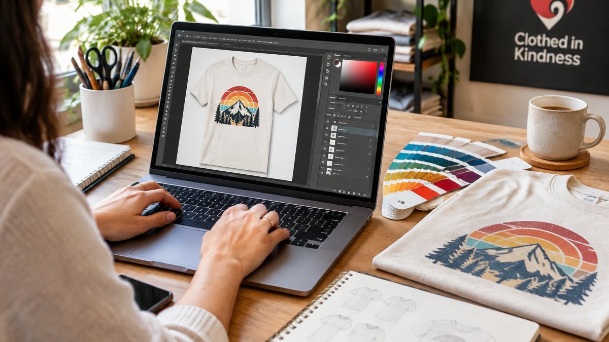
- Open the image and set the canvas to your final print dimensions, not the shirt dimensions. A full-front print is roughly 12 by 16 inches; a left chest is closer to 3.5 by 3.5. Build at the size it will print.
- Check Image Size and confirm the resolution reads 300 DPI at that size. Resampling up will not add detail, rebuild as vector or start over at the correct size.
- Convert to CMYK only if the shop asks for process printing. For spot-color screen printing, stay in RGB or grayscale and build spot channels instead; CMYK conversion shifts bright oranges, greens, and neons in ways that are hard to undo.
- Remove the background so only the design remains, then check the file against a dark fill layer. Any leftover white fringe will print as a halo on a dark garment.
- Clean up stray pixels, jagged edges, and stray color. Use Select > Color Range to catch near-white or near-black specks that hide against a light canvas but show on fabric.
- Separate each color onto its own channel or layer, and name each spot channel after the ink it represents so the shop can match it without guessing.
- Save a layered PSD for your records and export a PDF for the printer. Flatten nothing you might need to edit later.
Color Mode, Spot Colors, and Separations
RGB is for screens. CMYK is for process printing. Screen printing usually uses spot colors, which are mixed inks matched to a specific reference rather than blended from four process inks.
If the design has five colors, the shop needs five screens. Fewer colors usually means a lower setup cost and a cleaner print. That is a design decision, not just a technical one.
Two settings trip people up more than any others. The first is halftones. A gradient or photo in a screen-print file has to be converted to dots the mesh can actually hold, and the dot size has to match the screen mesh count.
The second is trapping, also called choke or spread. Tiny registration drift during the print run can leave a sliver of bare fabric between two adjacent inks, so trapping slightly overlaps the colors to hide the gap (Spreads and Chokes).
Watch out: converting text to outlines is not optional for screen printing.
If the design is built from original art rather than stock, the same separation logic applies, but the cleanup burden is usually lower because you control the source. The original art collection is a useful reference for how flat-color, screen-friendly designs are put together.
Building a Print-Ready Shirt Design File From Scratch
A print-ready shirt design file starts with the right canvas, not the right graphic. Get the dimensions wrong and everything downstream suffers.
For guidance on picking artwork that survives the printing process, this guide to choosing artwork for a printed hoodie covers what holds up on fabric versus what only looks good on a screen.
Canvas Size, Print Dimensions, and Placement
Set the canvas to the actual print area, not the whole shirt. Common placements and their approximate print areas:
- Full front: about 12 by 16 inches
- Left chest: about 3.5 by 3.5 inches
- Full back: about 12 by 16 inches
- Sleeve: about 2.5 by 2.5 inches
Keep important elements inside a safe margin so nothing clips at the edges, and center the design vertically within the print area. A shirt is not a flat rectangle, so placement looks different once the garment is worn.
Setting a Transparent Background for Shirt Printing
A transparent background for shirt printing means the fabric shows through everywhere the design does not cover. Without it, the printer reads the empty space as white ink or as a solid block of color.
In Photoshop, hide the background layer and export as PNG with transparency enabled. In vector software, delete the background shape and confirm no white box sits behind the art.
Screen Printing Artwork Separation Explained
Screen printing artwork separation is the process of splitting a full-color design into one layer per ink color.
For simple designs, separate manually by assigning each color to its own spot channel. For complex designs, shops often use software that automates the process.
Registration marks help the printer line up each screen. Leave them in if the shop asks for them, and remove them if the shop prefers a clean file.
Garment Color, Fabric, and Underbase Considerations
Fabric changes how ink behaves.
On light garments, the underbase is often skipped, which gives a softer feel. On dark garments, it is usually required.
If you want to see how a design lands on different pieces, browse the apparel collection to compare garment colors and fabrics side by side.
Choosing a garment color that matches one of your ink colors makes that part of the design disappear, so check contrast before you commit.
Cleanup, Proofing, and Common File Rejections
Cleanup is where good files become great ones. Simplify the artwork, remove stray pixels, merge overlapping shapes, and expand all text to outlines so fonts do not substitute on another machine.
A proof is a preview of how the design will print, including color shifts between screen and ink. Expect some difference, since screen color and printed ink rarely match exactly.
Most rejections fall into a handful of patterns. Here is the symptom-to-fix version, which is more useful than a list of what not to do:
- Pixelated or jagged edges. The file was built too small or upscaled. Rebuild at final print size at 300 DPI, or convert the art to vector.
- White box behind the design. The background was never removed, or the file was saved as JPG. Re-export as PNG with transparency or a PDF with no background layer.
- Missing or substituted fonts. Text was left live. Select all text and convert to outlines, then save a copy before flattening.
- Unexpected color shift. The file was converted to CMYK when the shop wanted spot colors, or the RGB values were never matched to a Pantone reference. Rebuild the spot channels and confirm the ink numbers with the shop.
Licensing and Accessibility Checks
Before the file ships, confirm the rights. Check that every font, stock graphic, and AI-generated element is licensed for commercial apparel use.
For accessibility, check contrast between the design and the garment, and make sure any text stays legible at the actual print size.
A simple preflight checklist saves a round of emails every time.
A file that looks perfect on a bright monitor can still fail on a dark garment, so preview the design on the actual garment color before approving the proof.
Frequently Asked Questions
What file format is best for printing artwork on clothing?
Vector formats like AI, EPS, and SVG are best because they scale without losing quality, which matters for clean lines and text. For raster designs, use a high-resolution PNG or PSD at 300 DPI with a transparent background. PDFs work well for proofs and layered files. Always ask your printer which format they prefer before you export, since apparel printing methods handle files differently.
What resolution should artwork be for shirt printing?
Aim for 300 DPI at the final print size. That means if your design prints at 12 inches wide, the file should be 3,600 pixels wide. Lower resolution shows up as blurry edges and pixelation on the garment, especially with detailed art or small text. Vector artwork sidesteps the issue entirely because it has no fixed resolution and scales cleanly to any print dimension.
How do you make a transparent background for a shirt design?
In Photoshop, remove the background layer and delete or mask out the areas you want to disappear, then export as a PNG with transparency enabled. In vector programs, simply leave the artboard empty behind your artwork. A transparent background for shirt printing lets the garment color show through, which matters most for DTG and DTF where no white underbase is used. Flatten only after you confirm the transparency is correct.
Can you print any image on clothing?
Not really. Photos and complex gradients print well with DTG and sublimation but struggle with screen printing, which works best with solid colors and clean edges. Low-resolution images, copyrighted art without a license, and files with unlicensed fonts can all get rejected. Check resolution, color mode, and licensing before uploading so your design clears the printer's review the first time.
